- Published on
Popup Documents using PnP IFrameDialog Control in SPFx
This article provides steps to implement the Popup Documents feature using PnP IFrameDialog Control in the SharePoint Framework (SPFx) Field Customizer Extension.
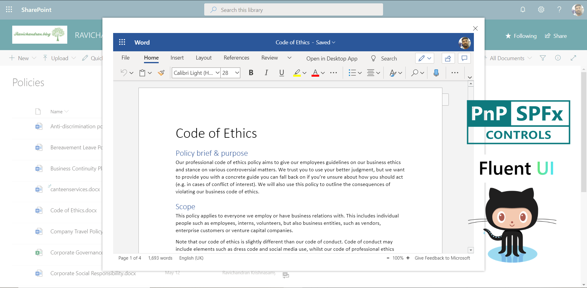
The PnP IFrameDialog control renders a dialog within an iframe as a modal. In this guide, we display documents in a popup directly from the SharePoint document library.
Create a New Extension Project
Open PowerShell or any terminal and run the following command:
yo @microsoft/sharepoint
When prompted:
- Select Extension.
- Choose Field Customizer.
- Select SharePoint Online only (latest).
- Enter your extension name and description.
- Select React as the framework.
After project creation, open the solution in Visual Studio Code.
Install Required Dependencies
Install the PnP Controls package.
npm install @pnp/spfx-controls-react --save --save-exact
Configure Custom Properties
In your component interface file, add the following code:
export interface ISpFxIFrameDialogExtensionProps {
  Filename: string;
  FileUrl: string;
}

export interface ISpFxIFrameDialogExtensionState {
  showDialog: boolean;
}
Import Dependencies
Add the imports inside your component file.
import * as React from 'react';
import styles from './IFrameDialogExtension.module.scss';
import { override } from '@microsoft/decorators';
import { BaseFieldCustomizer } from '@microsoft/sp-listview-extensibility';
import { IFieldCustomizerCellEventParameters } from '@microsoft/sp-listview-extensibility';
import { IFrameDialog } from '@pnp/spfx-controls-react/lib/IFrameDialog';
import { PrimaryButton } from 'office-ui-fabric-react/lib/Button';
Add the Render Logic
Below is the render method to open the document inside a popup dialog using PnP IFrameDialog.
public renderCell(event: IFieldCustomizerCellEventParameters): void {
  return (
    <div className={styles.cell}>
      <PrimaryButton
        text="View Document"
        onClick={() => this.setState({ showDialog: true })}
      />
      <IFrameDialog
        url={this.state.fileUrl}
        hidden={!this.state.showDialog}
        onDismiss={() => this.setState({ showDialog: false })}
        modalProps={{ isBlocking: false }}
        dialogContentProps={{
          type: 0,
          showCloseButton: true,
        }}
        width="100%"
        height="600px"
      />
    </div>
  );
}
Update the Field Customizer Manifest
Modify your extension manifest file (elements.xml) as shown below:
<Elements xmlns="http://schemas.microsoft.com/sharepoint/">
  <Field
    ID="{e5a3f02b-7e9a-4f3b-96b6-1bbeb7b8b0e2}"
    Name="PnPIFrameDialog"
    StaticName="PnPIFrameDialog"
    DisplayName="PnP IFrameDialog"
    Type="Text"
    Group="Custom Columns"
  />
</Elements>
Include the Field Customizer in Configuration
In the serve.json file, configure the list and field name to test locally.
{
  "$schema": "https://developer.microsoft.com/json-schemas/spfx-build/spfx-serve.schema.json",
  "serveConfigurations": {
    "default": {
      "pageUrl": "https://yourtenant.sharepoint.com/sites/YourSite/Lists/YourList",
      "customActions": {
        "SPFxIFrameDialogExtension": {
          "location": "ClientSideExtension.FieldCustomizer",
          "properties": {
            "sampleText": "Field Customizer Sample"
          }
        }
      }
    }
  }
}
Build and Deploy the Solution
Run the following commands to build, bundle, and package your solution:
gulp build
gulp bundle --ship
gulp package-solution --ship
Upload the .sppkg file to the App Catalog, deploy the solution, and associate the field customizer with your SharePoint list column.
Test the Popup
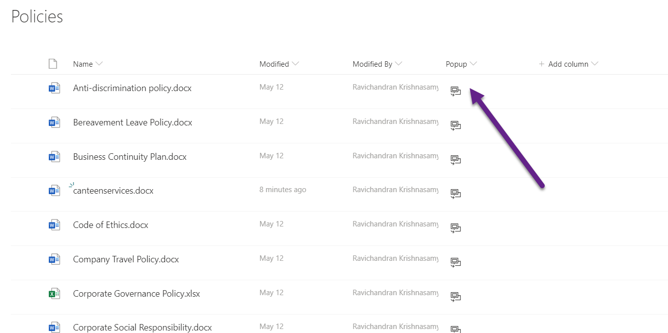
- Go to your SharePoint list.
- Edit the view and include the customized column.
- Click View Document — it should open inside a modal popup.
📂 GitHub Source
View full SPFx project on GitHub:Popup Documents using PnP IFrameDialog Control in SPFx
Summary
- PnP IFrameDialog simplifies document previews within SPFx.
- Field Customizer can integrate Fluent UI buttons for a seamless user experience.
- This technique improves usability by allowing inline document viewing without navigation.
If you have any questions, feel free to comment below.
Happy coding!
Author
 Ravichandran@Hi_Ravichandran